21 Best Medical Website Design Types to Inspire Your Healthcare Brand
A healthcare website is rarely visited in a neutral emotional state. Most visitors arrive carrying questions, uncertainty, or quiet concern. Some arrive looking for reassurance. Others need urgency, clarity, or confirmation. That reality places medical websites in a category of their own. They are not just digital representations of organizations. They are functional extensions of care.
The difference between an effective and ineffective healthcare website rarely comes down to aesthetics alone. It comes down to intent matching. Does the site understand why someone is there? Does it respect their time, emotions, and need for certainty? Does it communicate competence without sounding distant?
This long-form guide breaks down twenty-one high-performing medical website design types, not by naming brands, but by identifying proven structural approaches. Each type reflects a specific healthcare context, audience expectation, and ethical responsibility. Together, they form a practical framework for building sites that rank well, perform well, and, most importantly, serve people well.
Why healthcare website design demands a higher standard?
Healthcare is one of the few industries where poor digital experiences directly affect trust in real-world outcomes. Users subconsciously associate confusing interfaces with poor care. They associate broken links with unreliability. They associate unclear information with risk.
This is why strong medical website design is rooted in restraint, clarity, and empathy rather than creativity or persuasion.
Well-performing healthcare websites consistently:
- Reduce decision fatigue
- Prioritise patient intent over branding
- Communicate authority through structure, not claims
- Support accessibility by default
- Minimise cognitive effort during stress
The design types below follow these principles in different ways.
Large multi-specialty healthcare system website design
This design type serves expansive healthcare organizations with numerous departments, services, and patient categories. It prioritizes segmentation without fragmentation.
The core challenge here is scale. Thousands of pages, dozens of specialties, varying user intents. The solution is strict information hierarchy.
Key characteristics include:
- Clear top-level categories by user type
- Strong internal search as a primary navigation tool
- Consistent layout templates to reduce learning curves
- Deep internal linking that supports exploration without overload
Success depends on discipline. Without it, scale becomes chaos.
Patient-education-first medical content design
This approach centers around health education as the primary value driver. Visitors arrive with questions, and the design exists to answer them calmly and accurately.
Content is carefully structured for readability. Medical facts are broken into sections. Language prioritises explanation over compression.
Effective features include:
- Visible author and medical reviewer attribution
- Clearly displayed last-updated dates
- Logical progression from symptoms to causes to next steps
- Minimal visual interruption during reading
Trust here is earned through transparency rather than persuasion.
Academic medical institution website design
This type balances two audiences: patients and professionals. The design must communicate advanced expertise without alienating non-clinical readers.
The most important design decision is separation without isolation. Research content is accessible, but it does not dominate patient care pathways.
Common elements include:
- Distinct content zones for patient care and research
- Clear explanations of advanced procedures
- Structured service pages that interpret complexity in plain terms
- Conservative visual language that reinforces seriousness
Authority comes from clarity, not jargon.
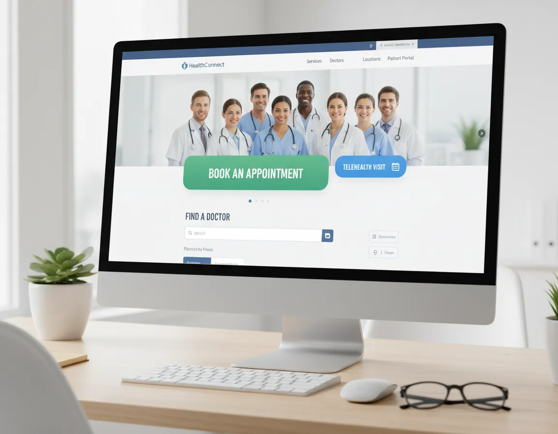
Integrated digital healthcare platform design
This design type mirrors the patient’s real healthcare workflow. It treats online interactions as part of ongoing care rather than standalone visits.
Navigation revolves around actions rather than categories.
Typical priorities:
- Appointment scheduling access at all times
- Secure messaging integrated seamlessly
- Lab and prescription pathways that feel intuitive
- Logical transitions between public and secure areas
The experience succeeds when patients feel the system works with them, not around them.
Hospital website with human-centered emotional tone
Some healthcare sites lean intentionally into warmth without sacrificing accuracy. This design type acknowledges emotion without exploiting it.
Imagery, language, and spacing all work together to reduce anxiety.
Key traits:
- Calm color systems with restrained contrast
- Photography that feels authentic, not staged
- Gentle language without false reassurance
- Clear access to help without urgency signals
Emotional neutrality is not the same as emotional distance.
University-affiliated healthcare website design
This type communicates deep institutional credibility while keeping patient navigation simple.
Research excellence is present, but it is contextualized.
Design strategies often include:
- Summarized research highlights linked to deeper content
- Clearly explained clinical applications of academic work
- Provider profiles that balance credentials with approachability
- Consistent layout across complex departments
Trust grows when expertise feels accessible.
Government or public healthcare website design
Public healthcare websites must serve everyone equally. Design neutrality becomes an asset.
This type prioritizes accessibility, comprehension, and uptime over branding.
Common standards:
- Strict plain language usage
- High-contrast accessibility compliance
- Minimal imagery to reduce load times
- Decision trees that guide users through common concerns
When clarity is inclusive, trust scales.
Localized regional healthcare website design
This design type adapts a broader healthcare framework for regional relevance.
Cultural nuance, language options, and familiarity guide interface decisions.
Effective localization includes:
- Regionally relevant imagery and phrasing
- Equally weighted multilingual access
- Local care pathways front-and-center
- Navigation patterns familiar to the target population
Localization fails when it feels translated rather than native.
Appointment-centric healthcare website design
Some healthcare websites exist to do one thing exceptionally well: enable access.
Everything else supports that function.
Design hallmarks:
- Prominent scheduling interfaces
- Search-driven navigation
- Real-time availability cues
- Minimal explanatory layers
Here, efficiency builds confidence.
Subscription-based or membership healthcare website design
This type communicates value through calm clarity rather than urgency.
Tone matters more than visuals.
Best practices include:
- Honest explanations of care models
- Clear boundaries around service scope
- Straightforward pricing explanations
- Design calmness that reflects stability
Confidence replaces persuasion.
Security, ethics, and patient confidence
Healthcare websites carry implicit ethical obligations. Privacy is assumed, not negotiated. Users expect their information to be handled responsibly without being reminded at every step.
A HIPAA compliant website design integrates data protection seamlessly into user experience. Security works best when it stays invisible and reliable.
Overemphasizing compliance language can create unease. Quiet strength builds confidence instead.
Research-heavy clinical service website design
Research-heavy clinical service websites operate at the intersection of advanced medicine and real-world care. These platforms often cater to multiple audiences at once—patients seeking clarity, clinicians looking for depth, researchers evaluating credibility, and even referring physicians exploring collaboration. The central challenge lies in communicating complex medical information without overwhelming or alienating non-expert users.
Strong structure becomes the backbone of this design type. Rather than forcing visitors to consume dense material in one continuous block, effective research-focused websites guide users through layered access. High-level summaries appear first, offering context and relevance. Only after this grounding does the site introduce technical depth, allowing motivated users to explore methodology, clinical outcomes, or supporting data at their own pace.
Expandable sections are essential here. Collapsible panels, structured subsections, and clearly labeled content layers give users control over how deeply they engage. This respects differences in medical literacy while preserving transparency. Dense information is not hidden—it is simply staged responsibly.
Cross-linking plays a critical role. Research findings connect directly to clinical service explanations, helping users understand how science translates into treatment. This connection increases trust and reinforces real-world applicability. Navigation supports exploration across disciplines without creating informational dead ends.
Tone matters as much as structure. Language remains factual and calm, avoiding academic posturing. Visual hierarchy supports comprehension instead of decoration. When executed well, this design type communicates authority naturally, demonstrating that expertise does not need to be forced or simplified excessively.
Depth is valuable only when users are invited into it—not pushed.
Specialty diagnostics medical website design
Specialty diagnostics websites serve highly specific medical functions, often dealing with advanced testing, precision measurements, and narrow clinical focus. Unlike general healthcare platforms, these websites must communicate both scientific rigor and absolute clarity, because misunderstandings at this level can undermine confidence entirely.
The power of this design type lies in its restraint. Breadth is intentionally sacrificed for depth. Visitors should immediately understand the diagnostic specialty, the conditions it supports, and the value it provides. Ambiguity creates doubt. Precision builds authority.
Clear explanations of specialized tests form the core of the content. These explanations do not rely on assumptions of prior knowledge. Instead, they define terms carefully, explain why the test exists, what it measures, and how results are interpreted. The tone remains neutral and educational rather than persuasive.
These platforms often serve dual audiences. Clinicians and medical professionals may require access to technical documentation, validation data, or research references. Patients, on the other hand, need reassurance and understandable explanations. A structured separation of professional and patient-facing content helps meet both needs without compromise.
Visual design reflects seriousness. Decorative elements are minimal. Colors remain restrained. Typography emphasizes readability. Every visual choice reinforces credibility rather than personality.
Educational materials are not buried. They are easy to locate, clearly labeled, and systematically organized. This transparency communicates confidence in the service being offered.
Specialty diagnostic websites succeed when they remain focused. Authority here does not come from scale but from clarity, accuracy, and disciplined communication.
Symptom-assessment healthcare website design
Symptom-assessment healthcare websites occupy one of the most ethically sensitive spaces in digital medicine. Users often arrive anxious, uncertain, or seeking validation for concerns they may not yet fully understand. Design choices carry emotional weight.
The primary responsibility of this design type is guidance without alarm. Language must remain neutral and measured, avoiding emotional triggers or diagnostic conclusions that exceed appropriate boundaries. Users should feel informed, not labeled.
Incremental information disclosure is essential. Rather than presenting exhaustive symptom lists or potential conditions immediately, effective platforms guide users step by step. Each stage builds context, allowing understanding to develop gradually. This approach reduces panic while maintaining honesty.
Disclaimers are handled carefully. Instead of aggressive legal language, effective designs use calm explanations that define limitations and encourage appropriate next steps without intimidation. Transparency builds trust when tone remains respectful.
Visual design avoids urgency cues unless absolutely necessary. Harsh colors, flashing alerts, or dramatic icons are deliberately excluded. Calm layouts help users process information rationally rather than emotionally.
Navigation supports choice rather than pressure. Users can pause, revisit earlier inputs, or exit without friction. This autonomy reinforces psychological safety.
The most effective symptom-assessment sites openly acknowledge uncertainty. They explain why answers may not be definitive and encourage professional follow-up when appropriate. By respecting the limits of digital assessment, these platforms build long-term credibility.
In this category, ethical restraint is not a limitation. It is the foundation of trust.
Elder-care and assisted-care website design
Elder-care and assisted-care websites communicate simultaneously with two emotionally connected but distinct audiences: aging individuals and their families. Decisions made in this space are often accompanied by guilt, fear, and concern. Design must recognize that reality without exploiting it.
Tone defines this design type. Language avoids sentimentality while remaining warm and reassuring. Overly emotional messaging can feel manipulative, while cold factual content can feel dismissive. The balance lies in honest clarity delivered with empathy.
Care levels are explained simply and directly. Differences between independent living, assisted care, memory support, or medical supervision are outlined without jargon. Families appreciate clarity when evaluating sensitive options.
Navigation is intentionally simple. Caregivers often browse these sites under stress or time pressure. Clear pathways, predictable menus, and visible contact options reduce frustration and decision fatigue.
Prominent contact paths matter. Phone numbers, inquiry forms, and consultation options are easy to locate. Users should never feel trapped in informational loops when they need human interaction.
Visual hierarchy supports calm reading. Images, when used, feel realistic rather than idealized. Content spacing encourages reflection rather than urgency.
Trust develops when these websites acknowledge the emotional complexity of elder care while remaining grounded, factual, and respectful. Empathy here is communicated through clarity, not dramatization.
Multi-location healthcare network website design
Multi-location healthcare networks face a unique digital challenge: maintaining cohesiveness while supporting local relevance. Patients should recognize every location as part of the same system without feeling disconnected from their immediate care environment.
Consistency is the foundation. Design language remains uniform across all locations. Fonts, color systems, navigation placement, and content structure are standardized. This consistency reduces cognitive effort and reinforces system-wide credibility.
Navigation placement does not vary by location. Users build familiarity quickly, knowing where to find services, providers, or appointment access regardless of geography. Familiar patterns equal comfort.
Local customization exists within controlled boundaries. Location-specific details such as addresses, operating hours, physician rosters, and regional services are incorporated without altering the baseline structure. This balance creates relevance without fragmentation.
Centralized content governance ensures accuracy and alignment. Core pages are maintained system-wide, reducing inconsistency and outdated information. Local teams contribute details without disrupting integrity.
Predictability matters more than creativity here. Patients navigating across locations—especially during transfers or referrals—should feel continuity, not disruption.
When executed well, this design type reinforces the idea that care quality remains consistent, regardless of where it is delivered.
High-volume medical information website design
High-volume medical information websites often become victims of their own success. As content expands, usability suffers unless structure remains intentional. More information does not automatically equate to more value.
Structure determines trust. Readers assessing medical information frequently scan before committing. Clear headings, short paragraphs, and logical segmentation allow users to find relevance quickly.
Modular content sections prevent fatigue. Information is grouped meaningfully, allowing readers to consume knowledge in manageable portions. This supports different reading behaviors, from quick reference checks to deep learning sessions.
Related-topic pathways guide exploration thoughtfully. Instead of overwhelming users with endless links, effective platforms suggest contextually relevant next steps. This maintains focus while encouraging deeper understanding.
Layout prioritizes standability. White space, readable fonts, and consistent formatting help stressed readers absorb information efficiently. Dense walls of text undermine credibility, regardless of content quality.
Importantly, language respects varied literacy levels without oversimplifying. Medical terminology is explained clearly and used consistently.
These websites earn trust not by displaying volume, but by demonstrating respect for attention limits and cognitive load.
Pediatric-focused healthcare website design
When children are involved, healthcare decisions carry heightened emotional sensitivity. Pediatric-focused website design reflects that reality while maintaining professional seriousness.
The visual tone is deliberately gentle. Colors are calming, imagery is supportive but not childish, and layouts feel approachable. Distraction is avoided to keep attention on essential information.
Language plays a central role. Content speaks primarily to parents or caregivers while remaining respectful toward young patients. Medical explanations are clear, supportive, and reassuring without minimizing concerns.
Instructions are explicit and actionable. Parents value clarity, especially when managing symptoms, appointments, or preparation steps. Ambiguity increases anxiety.
Navigation reflects family workflows. Information is grouped around common parental concerns rather than hospital department structures. This alignment reduces frustration and improves comprehension.
Emotional cues are used sparingly and appropriately. Overly playful design risks undermining seriousness, while overly clinical presentation feels cold.
Effective pediatric healthcare design communicates one message consistently: care is competent, thoughtful, and centered on the child’s wellbeing.
Urgent care medical website design
Urgent care websites exist in tension between speed and calm. Patients arrive seeking immediate answers, but panic undermines decision-making. Effective design resolves that tension through efficiency without alarm.
Immediate access to location details and availability sits at the center of the experience. Users should not scroll or search unnecessarily. The path to care is visible instantly.
Service outlines are clear. Visitors quickly understand what conditions are treated and which require emergency services elsewhere. This clarity prevents misuse and builds trust.
Waiting time expectations are communicated transparently when possible. Even approximate guidance reduces anxiety.
Visual interruption is minimized. No flashing elements, countdown timers, or sensational language distract from decision-making.
The tone remains factual and supportive. Urgency is conveyed through structure and accessibility, not emotional pressure.
Efficiency becomes reassurance when users feel guided rather than rushed.
Medical decision-support website design
Decision-support healthcare websites help patients compare options, not choose for them. Neutrality defines credibility in this category.
Transparent criteria explanations are essential. Users understand how information is organized, what metrics mean, and what limitations exist.
Comparisons are structured logically. Data is presented side-by-side using consistent frameworks to support clarity.
Metrics are defined in plain language. Assumptions are avoided. Users retain autonomy rather than being guided toward predetermined conclusions.
Interpretive bias is minimized deliberately. Language avoids suggestion or endorsement. The platform’s role is to inform, not persuade.
Empowerment grows when users feel respected intellectually and emotionally. Trust follows that respect.
Advanced clinical center website design
Advanced clinical center websites communicate complexity without intimidation. Their role is to explain sophisticated care in ways that remain understandable.
Visual elements serve explanation. Diagrams and motion clarify processes rather than decorate pages. Every visual has a purpose.
Performance remains optimized. Heavy visuals never compromise load speed or accessibility.
Technical depth is balanced. Summary explanations provide context before detailed clinical descriptions appear.
Care pathways are visualized logically, helping patients understand what to expect across treatment stages.
Sophistication emerges through clarity, not spectacle.
Small private practice and boutique clinic website design
Small practices benefit from agility. Their websites succeed by being direct, personal, and focused.
Specialization is immediately clear. Visitors understand why the practice exists and who it serves within seconds.
Practitioner credentials are prominent without excessive biography. Authority is visible yet approachable.
Communication access is direct. Contact options are clear, personal, and responsive.
Content remains lean. No redundancy, no excessive messaging, no fillers. Every page has purpose.
Authenticity matters more than polish here. Patients value clarity, responsiveness, and honesty above visual complexity.
Search engines reward usefulness, not tactics
Healthcare websites aligned with Google’s E-E-A-T principles share common traits:
- Clear authorship and factual accountability
- Updated medical content with review signals
- Logical internal linking
- Structured data that reflects real intent
- Content written for humans first
Ranking follows trust
Building on the structural patterns discussed above, it becomes clear that successful healthcare websites are not defined by aesthetics or technology alone. They function as decision environments. Every design decision either supports understanding or creates friction. As digital healthcare matures, the difference between adequate and exceptional platforms lies in how deeply they respect user context and cognitive load.
What follows addresses the often-overlooked layers that determine whether a healthcare website merely exists or consistently performs.
Information hierarchy as a trust signal
Users rarely think consciously about hierarchy, but they feel it immediately. When healthcare information appears disordered or inconsistent, users interpret that disorder as operational risk. This reaction is instinctive.
Effective healthcare websites treat hierarchy as a form of reassurance. Important actions are surfaced early. Supporting information appears when needed, not before. Secondary content remains accessible without competing for attention.
Headings do more than organize text. They communicate priorities. When headings reflect patient intent rather than internal department structure, comprehension improves dramatically. For example, users think in problems, not services. Organizing pages around concerns rather than institutional categories reduces mental translation.
Hierarchy also supports credibility. Clear progression tells users that someone knowledgeable has structured the experience thoughtfully. This perception matters as much as the content itself.
Content governance and long-term credibility
Healthcare websites age quickly. Medical understanding evolves. Protocols change. Staff turnover occurs. Without strong content governance, even well-designed platforms quietly undermine themselves.
Effective governance includes:
- Ownership clarity for every content section
- Defined review cycles based on clinical relevance
- Version control for updates and revisions
Clear separation between evergreen and time-sensitive material
Outdated medical content damages trust more than missing content. Users often cannot evaluate accuracy directly, but they can detect neglect. Dates, review disclaimers, and revision transparency help counter that perception.
Governance is not editorial bureaucracy. It is clinical responsibility reflected digitally.
Accessibility beyond compliance
Accessibility in healthcare cannot stop at checklist compliance. Many users are navigating sites while stressed, medicated, elderly, injured, or cognitively overwhelmed.
Design that truly supports accessibility considers:
- Readable type sizes by default
- Generous line spacing and contrast
- Clickable areas designed for limited dexterity
- Logical keyboard navigation
Clear error messaging without blame
Accessibility also includes situational limitations. A parent holding a child. A patient using a phone one-handed. Someone in a noisy emergency room environment.
Design that works only in ideal conditions fails real users. Inclusive design anticipates imperfect circumstances.
Performance as silent reassurance
Performance rarely earns praise, but slow performance actively damages credibility in healthcare contexts. Delays create unease. A slow-loading page feels incompatible with care delivery.
Optimized healthcare websites prioritize:
- Lightweight page rendering
- Minimal blocking scripts
- Predictable loading behavior
Graceful handling of poor connections
Importantly, performance consistency matters more than peak speed. Users forgive slight slowness. They distrust inconsistency.
A platform that loads reliably communicates operational stability even before content is read.
Language calibration and emotional neutrality
Healthcare language walks a narrow line. Too clinical feels cold. Too conversational feels dismissive.
Effective platforms calibrate language carefully:
- Medical terms are explained, not avoided
- Emotional language is restrained, not eliminated
- Assumptions about feelings are minimized
Instructions are direct and respectful
Avoiding emotional exaggeration does not mean ignoring feelings. It means leaving space for users’ own interpretations rather than imposing tone.
Calm language supports clearer decision-making.
Visual restraint as ethical design
Visual design in healthcare carries ethical weight. Strong visual cues influence behavior, and that influence must be exercised responsibly.
Ethical visual restraint includes:
- Avoiding fear-based imagery
- Limiting color usage that implies urgency
- Using icons consistently and sparingly
- Ensuring visuals clarify rather than persuade
Every visual element should answer a simple question: does this help understanding?
If not, it deserves reconsideration.
Mobile-first not as trend, but necessity
Healthcare browsing increasingly happens on mobile devices, often during moments of vulnerability. Mobile-first thinking requires more than responsive layouts.
It requires:
- Touch-friendly navigation
- Reduced scrolling fatigue
- Clear thumb-zone prioritization
- Immediate access to essential actions
Mobile users are not secondary users. In many healthcare contexts, they are the primary audience.
Designing for mobile first improves clarity across all devices.
Structured data as interpretation support
Search platforms increasingly rely on structured data to interpret authority, relevance, and context. For healthcare websites, structured data supports discoverability without distorting meaning.
Clear structure helps systems understand:
- Medical subject boundaries
- Content relationships
- Authorship and review attribution
Update frequency
This benefits both machines and humans. When structure is intentional, content surfaces appropriately without manipulation.
- Visibility follows clarity.
- Internal linking as guided learning
Healthcare information often triggers follow-up questions. Internal linking should anticipate those questions without overwhelming users.
Effective internal linking:
- Follows logical conceptual flow
- Appears contextually rather than generically
- Avoids excessive option flooding
- Supports learning progression
Links function best as quiet suggestions, not demands for attention.
Role clarity across audiences
Many healthcare websites attempt to serve everyone simultaneously. This often leads to diluted messaging.
Instead, effective platforms define clear pathways for:
- Patients
- Caregivers
- Medical professionals
- Referring providers
Administrative users
These pathways do not need isolation. They need recognition. Labeling and segmentation reduce confusion and increase efficiency.
Role clarity improves satisfaction without requiring separate platforms.
Ethical persuasion versus manipulation
All healthcare websites influence behavior. The distinction lies in how.
Ethical influence:
- Encourages informed decisions
- Respects uncertainty
- Avoids pressure framing
- Provides alternatives clearly
- Manipulative influence:
- Exploits fear or urgency
- Hides limitations
- Uses misleading emphasis
- Reduces choice visibility
- Users sense the difference even if they cannot articulate it.
Trust grows when persuasion feels optional rather than imposed.
Measurement that respects privacy
Analytics in healthcare environments must balance insight with respect. Over tracking creates discomfort even when compliant.
Responsible measurement focuses on:
- Aggregated behavior patterns
- Task completion success
- Navigation friction points
- Content comprehension signals
- Tracking should inform improvement, not surveillance.
Privacy-conscious analytics align with patient expectations.
Designing for uncertainty instead of certainty
Healthcare rarely provides absolute answers. Websites that pretend otherwise lose credibility quickly.
Designing for uncertainty involves:
- Explaining ranges rather than guarantees
- Acknowledging variability openly
- Encouraging professional consultation appropriately
- Avoiding deterministic language
This honesty strengthens trust rather than weakening confidence.
Content tone consistency across touchpoints
Inconsistent tone creates emotional whiplash. A calm homepage followed by aggressive messaging further in the journey damages continuity.
Tone guidelines should apply across:
- Educational content
- Appointment flows
- Error messages
- Confirmation screens
- Follow-up communication
Consistency reassures users that the organization operates deliberately.
Long-term scalability planning
Healthcare websites rarely remain static. New services emerge. Regulations evolve. Technologies change.
Scalable design anticipates:
- Modular content expansion
- Flexible navigation growth
- Design systems rather than one-off layouts
- Documentation for future teams
Scalability preserves clarity over time.
Closing extension perspective
The strongest healthcare websites feel uneventful. They do not impress loudly. They work quietly.
Their success lies in what users do not notice:
- Reduced anxiety
- Clear understanding
- Confidence in next steps
- Trust in competence
Effective healthcare design is not about standing out. It is about standing steady when users need stability most.
Final thoughts
Healthcare websites are not marketing assets disguised as platforms. They are functional trust systems.
The best modern medical website design types succeed because they respect the reality of why people visit them. They do not shout. They do not overwhelm. They do not promise what care itself cannot guarantee.
They inform. They guide. They reassure.
And when done correctly, they quietly earn trust long before care begins.
Ready to upgrade your medical website? Get a free design consultation today.