
How to Design a Mobile Appointment Journey for a Busy Medical Website
Eight steps to design a fast mobile appointment journey: obvious entry point, fewer screens, thumb-friendly forms, clear confirmation and testing.
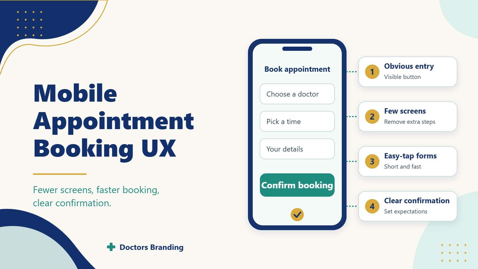
Busy patients book on their phones between other tasks. A slow or confusing mobile flow loses them. Strong mobile medical appointment booking UX removes steps, builds trust quickly, and finishes the booking before the user is interrupted. This how to guide shows how to design that journey for a medical website.
The goal is a path that works with one hand, on a small screen, in under two minutes. Every extra tap or unclear label raises the chance the patient abandons the process.
Why Mobile Appointment Design Needs Special Care
Most healthcare site traffic now comes from phones. Patients often search and book while commuting, at work, or caring for family. They have limited attention and low tolerance for friction.
Poor mobile flows create high drop off even when desktop conversion looks acceptable. Good mobile medical appointment booking UX treats the phone as the primary device and designs for speed, clarity, and reassurance.
Start With the Real Patient Context
Map the situations in which people book.
Common mobile scenarios
- Quick search after a symptom appears
- Booking during a lunch break
- Parent arranging a child visit while multitasking
- Follow up appointment after a call with the clinic
- Evening research that turns into an immediate booking
These contexts demand large tap targets, short forms, and visible progress. Designing for them keeps mobile medical appointment booking UX practical.
Step 1: Make the Booking Entry Point Obvious
The path must start with a clear, persistent button.
Design rules
- Place a high contrast “Book Appointment” button in the sticky header
- Repeat the same button after key service descriptions
- Use action language rather than “Submit” or “Learn More”
- Ensure the button is at least 48 pixels tall for easy tapping
Patients should never hunt for the next step. Immediate visibility is the first requirement of effective mobile medical appointment booking UX.
Step 2: Reduce the Number of Screens
Every additional screen increases abandonment. Aim for the fewest steps that still collect what the clinic needs.
Ideal short flow
- Choose service or reason for visit
- Pick provider or first available
- Select date and time
- Enter basic contact and insurance details
- Confirm
Combine related choices on one screen when possible. Show a simple progress indicator so users know how many steps remain. Shorter flows improve completion rates in mobile medical appointment booking UX.
Step 3: Design Forms for Thumbs and Speed
Mobile forms fail when fields are small or demand too much typing.
Form best practices
- Use large input fields with plenty of spacing
- Trigger the correct keyboard (number pad for phone, email keyboard for email)
- Offer autofill support for name, phone, and email
- Make only essential fields required
- Allow insurance selection from a short list rather than free text when possible
- Show inline validation so errors appear immediately
Test the form with one thumb. If it feels awkward, simplify further. Smooth data entry is central to strong mobile medical appointment booking UX.
Step 4: Show Real Availability Early
Patients abandon when they invest time only to find no suitable slots.
Availability tactics
- Display open times as soon as service and provider are chosen
- Offer “first available” as a default option
- Let users filter by morning, afternoon, or specific days
- Update the calendar instantly without page reloads
- Indicate if a slot is filling quickly when that information is accurate
Early visibility of real times reduces wasted effort. It is a key trust and efficiency feature in mobile medical appointment booking UX.
Step 5: Build Trust at Every Step
Medical bookings involve personal health information. Users need constant reassurance.
Trust elements to include
- Short privacy note near the form
- Clear statement of what will happen after booking
- Provider photo and credentials on the selection screen
- Clinic address and phone number visible or one tap away
- Secure connection indicators
- Option to call instead of completing the form
These signals lower anxiety. They keep users moving through mobile medical appointment booking UX even when they feel rushed.
Step 6: Handle Interruptions Gracefully
Phone users get calls, messages, and app switches. The journey must survive these breaks.
Resilience features
- Save progress automatically so users can return
- Send a magic link or text to resume on any device
- Keep the session alive for at least 30 minutes
- Allow easy restart without losing earlier choices
Designing for real life interruptions prevents lost bookings. This practical detail strengthens mobile medical appointment booking UX.
Step 7: Confirm Clearly and Set Expectations
The final screen and follow up messages must remove doubt.
Confirmation essentials
- Show date, time, provider, and location in large text
- Provide add to calendar and get directions buttons
- State any preparation steps in one or two lines
- Send an immediate text or email confirmation
- Include an easy way to reschedule or cancel
A strong close reduces no shows and support calls. It completes the promise of good mobile medical appointment booking UX.
Step 8: Optimise for Speed and Accessibility
Technical performance and inclusive design affect completion as much as layout.
Performance and access checks
- Page and form should load in under three seconds on average mobile connections
- All buttons and fields must work with screen readers
- Colour contrast must meet accessibility standards
- Text must remain readable without zooming
- The flow must function in both portrait and landscape
Fast, accessible experiences serve more patients. They are non negotiable parts of professional mobile medical appointment booking UX.
Test With Real Users on Real Phones
Internal reviews miss many problems. Watch actual patients or staff complete bookings on their own devices.
Testing focus areas
- Time to complete the full journey
- Points where users hesitate or go back
- Errors caused by small tap targets
- Confusion about insurance or provider choice
- Success rate when the user is interrupted
Fix the highest friction points first. Repeated short tests improve mobile medical appointment booking UX faster than long planning cycles.
Measure What Matters After Launch
Track mobile specific numbers so you can keep improving.
Key metrics
- Mobile booking start rate
- Completion rate by step
- Average time to book on mobile
- Drop off points in the funnel
- Reschedule and cancel rates
- Support contacts related to booking problems
Compare these figures before and after each design change. Rising completion and falling time to book confirm that mobile medical appointment booking UX is working.
Common Mistakes to Avoid
Many medical sites repeat the same mobile problems.
Frequent errors
- Desktop forms simply shrunk to fit the phone
- Too many required fields on the first screen
- No progress indicator
- Calendar that is hard to tap
- Confirmation that arrives only by email
- No easy way to call the clinic mid flow
Each mistake increases abandonment. A deliberate mobile medical appointment booking UX process eliminates them.
Special Considerations for Different Clinics
Adjust details while keeping the core short flow.
General practices emphasise speed and same day or next day slots.Specialty clinics may add a short reason for visit or referral note.Multi location groups must let users pick site early and show only relevant times.High volume clinics benefit from “first available” prominence and wait list options.
The same principles of clarity and fewer steps apply everywhere. Tailoring keeps mobile medical appointment booking UX relevant to each patient group.
Maintaining the Journey Over Time
Review the flow every few months or after any scheduling system change.
Ongoing habits
- Check new device sizes and browser updates
- Re test after adding services or insurance plans
- Watch support tickets for recurring mobile complaints
- Update copy when preparation instructions change
- Keep confirmation messages short and accurate
Regular care prevents the experience from degrading. It protects the gains from careful mobile medical appointment booking UX design.
A well designed mobile appointment journey respects the patient’s limited time and attention. It starts with an obvious button, moves through few clear steps, shows real availability, and ends with unmistakable confirmation. Test on real phones, measure completion, and remove friction wherever it appears. Clinics that treat mobile medical appointment booking UX as a core patient experience fill more appointments with less staff effort and fewer abandoned attempts. Begin with the entry point and the form. Make both fast and obvious. The rest of the journey becomes easier to perfect.
Keep reading
More from the Doctors Branding blog
-
Why Booked Appointments and Form Leads Are Different Marketing Measures
Why form leads and booked appointments are different measures, how to track them separately and how to improve the step...
Read article → -

What Patients Look For When Comparing Cosmetic Surgeons
What patients compare when choosing a cosmetic surgeon: consultation experience, recovery details, before and after photos, credentials and costs.
Read article → -

What Patients Look For When Comparing Dermatologists
How patients compare dermatologists for medical skin, hair and aesthetic care: credentials, photos, reviews, access and what practice pages should...
Read article →
Want this kind of thinking applied to your practice?
Start with a conversation about where your doctor, clinic or hospital marketing stands today.